

Pictures may be worth a thousand words, but they can also help put numbers into a clearer perspective.
That‘s why USDA’s Economic Research Service (ERS) each day presents a graph or map with brief accompanying text that tells a visual mini-story about food, farming or rural America. Delivered to PCs, smartphones and tablets via email as well as being posted on our website, these “Charts of Note” provide daily snapshots of ERS research and findings. They cover facts and data that are timely, informative and sometimes surprising.
If you follow the ERS Charts of Note series on our website, you would know, for example that:
Among dairy products consumed by Americans in 2014 (cup-equivalents), cheese accounted for the largest share;
Ten percent of all land in farms is expected to be transferred in the period 2015-19; and
Three post-farm industry groups – foodservice, retail trade and processing – make up over 60 percent of the retail food dollar.
Charts of Note are often used by journalists to generate stories, by policy makers and researchers to support their work, and by anyone with an interest the food, farm and rural economic sectors. They’re designed to be easily shared, repurposed and reproduced by media outlets and other users.
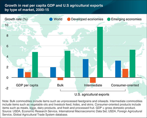
In each of the last few years, the editors at ERS have selected a ranked list of the “10 best” Charts of Note for the past year. The 10 are those considered worthy of a second look because of their effectiveness in providing context to the year’s headlines or presenting key insights from our agency’s research. The 10 best Charts of Note in 2016, selected from 244 posted during the year, appear in a new chart gallery on the ERS website.
This year’s top 10 cover a range of topics including agricultural trade, farmland ownership, farm productivity, farm income, food consumption and food insecurity. The top-ranked chart (above) illustrates that emerging economies (e.g., China, Mexico and Brazil) are accounting for most of the growth in U.S. agricultural exports.
I invite you to view Charts of Note on our website. Or, you can make a New Year’s resolution to sign up for a free subscription to Charts of Note and receive them daily via email.